Publication Widget
Document version 4.3.5
Overview
This article describes the integration process of the Publication Widget provided by the Popsell platform. This widget is intended to display Popsell contents on an external website (brand and member publications) and enable some interactions (zoom, comment, like …)
This widget can be displayed in two different ways:
Stack mode
Each publication card adapts to the size of its content, to avoid image cropping as much as possible.
The “Stack mode” adapts to the screen: from 1 to several columns, depending on the width of the screen. Typically, on a mobile screen, this widget will appear in a single column, just like a social feed.
A “Load more” button can be displayed.
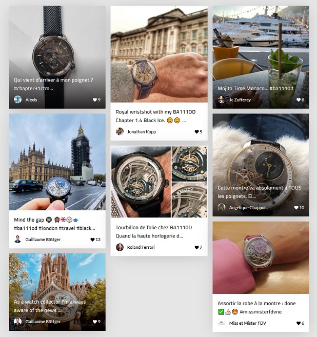
Widget displayed with stacked publications
Slider mode
The Slider mode will display cards with the same height, horizontally, and enabling to scroll them horizontally.
On a mobile, one card will be visible, plus a cut-off of the second image
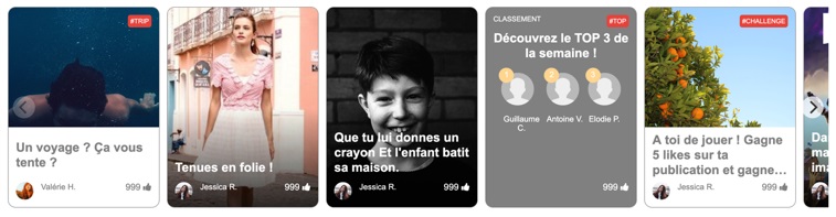
Widget displayed as a slider
Filters
The publications displayed in the widgets can be filtered through 3 different parameters :
Products : allows to display only the publications to which a specific product is attached
Categories : allows to display only the publications to which a product of a specific category is attached
#Hashtags : allows to displays publications in which the author has added a specific hashtag
These filters can accept several values and be combined (logical operator "OR").
Publications linked to specific Products ID are returned in first position.
Prerequisites
The use of this widget is subject to certain prerequisites:
Installation of the Popsell Boostrapper. Please refer to Popsell Bootstrapper Tag [Prerequisite]
This widget needs the Session widget to be enabled. See Session Tag
It will be used to retrieve informations such as guest / user Api keys.To display the ambassador's posts, you must have an API key to authenticate the requests as this one. If you do not have one or if you wish to provide a list of public posts, you will need a guest API key (limited features).
If you do not meet the above requirements, you will not be able to use the widget properly.
If you need assistance with the validation of the prerequisites, you can contact our tech team at the following address: tech@popsell.com.
How it works
The widget is developed as a Vue.JS plugin. No dependency management is required, and its installation is as simple as possible.
Customization of the widget is possible by simply overlaying the generated CSS, all classes are named so as not to impact the rest of your application.
Tag
<popsell-publications></popsell-publications>Attributes
attribute | type / default value | description | mandatory |
|---|---|---|---|
| String | Needed to authenticate the requests. | only if no other API key is provided (in this widget or in the session widget) |
| String | Needed to authenticate the requests. | only if no other API key is provided (in this widget or in the session widget) |
| String default: | Sets the display mode :
| false |
| Boolean default: | Displays Likes on each post. (slider/page mode) | false |
| Boolean default: | Displays comments on each post. (slider/page mode) Displays comments on the each post detail. | false |
| Number default: | Sets the number of posts displayed on slider mode. On page mode, it sets the number of posts fetched on each ‘load more’ request. | false |
| String | Sets a filter based on one or several products IDs (comma separated list) | false |
| String | Sets a filter based on one or several product category IDs (comma separated list) | false |
| String | Sets a filter based on one or several Hashtags (comma separated list) *** Not yet implemented in current version *** | false |
card-height | Number default: 314 | Define the card height in pixels. The slider mode automatically keep 9/16 aspects ratio of the card. | false |
Integration example
<popsell-publications
      guest-api-key="guestApiKey"
      user-api-key="userApiKey"
      mode="stack"
      display-comments="true"
      display-likes="true"
      limit="30"
      product-filter="REF123"
      category-filter="C3522,C5677"
      hashtag-filter="#watch"
></popsell-publications>
Adding a custom Title and/or Footer
If needed, a custom HTML section can be added before and/or after the Widget content.
These sections will only be displayed if at least one publication is displayed in the Widget. In other words, this will prevent having a Title being displayed when the widget is empty.
The title object must contain a slot attribute "popsell-publications-title" to be displayed above the Widget, and the footer must contain a slot attribute "popsell-publications-footer" to be displayed below.
The CSS must be embedded in a <style> tag, because the style of the parent cannot be applied inside the component. The parent’s CSS file can be imported, as in the example below.
<popsell-publications>
    <style slot="popsell-publications-style">@import url("https://site-example/style.css")</style>
    <h1 slot="popsell-publications-title">Title example</h1>
    <p slot="popsell-publications-footer">Footer paragraph example</p>
</popsell-publications>
Be sure to scope your style with CSS selectors. Styling is not applied from host to component, but is applied from component to host !
About Flash Of Unstyled Content (FOUC)
Flash of unstyled content (fouc) may occur whether the user network is slow or the user computer is limited. In order to avoid this kind of behavior, we strongly recommand to add some CSS Code in your stylesheets.
A tag can be styled and behave exactly as a html tag. Combined with :not and :defined attributes, we can easily hide a tag when the content is not ready yet.
popsell-publications:not(:defined) {
  display: none;
}
The widget will automatically appears when it will be ready and the component hydrated.
Hooks
Events system
Popsell allows you to hook certain parts of the application in order to track user events. For example, when a user clicks on some buttons, you’ll be able to know which button has been clicked and from which context. It is particularly useful if you plan to link systems like Google Analytics.
Available Community tag events
Our tags use the power of web-components and are fully compatible with native Javascript event bus.
In order to hook an event, just plug the listener as you would usually do in a normal Javascript environment.
document.querySelector('popsell-community').addEventListener(<event type>, (event) => {
  //event.detail[0] contains all popsell informations you would need
});
Hook | Event Type | Element | Action | Data |
|---|---|---|---|---|
Click on a post | interact | zoom_post | click |
JS
|
Open a product linked to a post | navigate | open_product | open |
JS
|
Sign in in order to be able to like or comment a post | navigate | button_sign_in | open |
JS
|
Sign up in order to be able to like or comment a post | navigate | button_sign_up | open |
JS
|
Widget has posts | status | has_posts | ready |
JS
|